September 5, 2023
7 Signs it’s Time to Update your Website
A website works as the digital face of your brand in today’s rapidly changing digital world. 94% of people’s first impressions of a website come from its aesthetic design.
It’s often the first handshake a customer has with a brand, influencing their trust and buying decisions. It is never a good idea to make a website typical and non-adaptable. They have to grow, adapt, and be on their toes to stay relevant.
Imagine walking through a city and stumbling upon a store that looks like it hasn’t changed in decades. While there might be a nostalgic charm to it, you would probably question its relevance and modern-day utility.
Similarly, a website that remains untouched becomes an artifact of its time. It steadily loses its ability to connect with a changing audience and its ever-evolving expectations.
Irrespective of business size and domain, updating a website is key to success. But about how it feels to users, influences their trust, and converts their visits into action.
Know the 7 signs that describe it’s time to update your website. From glaring issues to nuanced ones, these pointers will help you gauge where your website stands in the modern digital game.
1. Outdated Design
In the realm of digital aesthetics, paradigms shift as swiftly as in the domain of fashion. A design approach that was the buzzword years ago may not work in the current scenario. Nevertheless, this transcends mere trend-chasing.
It’s pivotal to guarantee that your website delivers an instinctive, captivating, and seamless user journey. The new-age design philosophy strikes a balance between visual allure and operations, pivoting around user-centric principles.

Recognizing the Signs:
-
Fixed-width Frameworks
These were the blueprints ago and now are down. Given the wide array of devices, responsive design has become imperative. Relying on fixed-width today is analogous to a mismatched jigsaw puzzle.
-
Flash Components
Once a trailblazer, Flash is now in digital retirement. With the contemporary browsers sidelining Flash, we now lean on more streamlined, universally accepted tech, namely HTML5 and CSS3.
-
Stock Image Saturation
While stock images are handy, higher dependency gives a website an impersonal ambiance. The digital audience of today is in pursuit of reliability— they resonate with genuine narratives, relatable personas, and tangible experiences.
-
Congested Layout
The zeitgeist now gravitates towards minimalist elegance. Present-day web designs prioritize clarity.
Ensure that the users are not stuck with information. Each component, be it text or graphic, must justify its presence. If your site exudes a sense of chaotic aggregation, introspection is due.
2. Not Mobile-Friendly
The last decade heralded a tectonic shift in user preference from desktops to mobile interfaces for browsing. 82.2% of web traffic comes from mobile phones, and 74% of visitors choose mobile-friendly websites.
Mobiles have seamlessly integrated into our routines, redefining users’ expectations. Modern netizens not only anticipate flawless mobile loading but also an experience tailored for compact screens and tactile navigation.
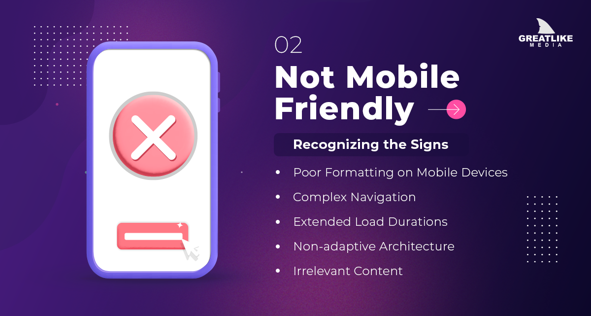
Recognizing the Signs:
-
Poor Formatting on Mobile Devices
A misaligned display on mobile devices repels users. Elements like wrong text, overlapping graphics, and improperly scaling images are glaring oversights.
-
Complex Navigation
Desktops may not consider intricate navigation owing to their size, however; mobiles do. If users grapple with excessive zooming or a maze-like menu, they’ll likely abort their visit.
-
Extended Load Durations
In today’s digital age, waiting is not an option. Mobile users, frequently multitasking, demand rapid loading. Each incremental delay in loading enhances the bounce rate.
-
Non-adaptive Architecture
Transitioning to mobile isn’t merely about condensing content. It necessitates a holistic reimagining of the mobile menu. And ensure the perfect optimization of elements, graphics scale, and interactions for touch.
-
Irrelevant Content
If your platform uses elements that are non-compliant with mobile, you’re presenting an incomplete and irksome experience.
3. Declining Web Traffic
For any digital platform, web traffic serves as a crucial performance metric. It’s analogous to foot traffic for a brick-and-mortar store. An influx of visitors offers more chances for engagement, potential sales, and brand establishment.
When this number starts dwindling, it’s not just a matter of fewer numbers. It shows that your digital space may not be as relevant as before. Thus, website updates are essential for your business.
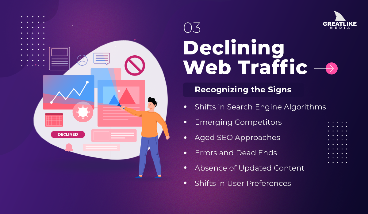
Recognizing the Signs:
-
Shifts in Search Engine Algorithms
Google, being the driving force in the realm of search, consistently revises its algorithms. If websites are not prone to these changes, there will be a big down in search rankings. It will lead to a loss in organic visibility.
-
Emerging Competitors
The digital world is ever-evolving, with new entrants each day. If these new players bring innovative content, superior user experience, or more contemporary solutions, they may affect potential audiences.
-
Aged SEO Approaches
SEO strategies that were effective a few years ago may now be outdated—or even counterproductive. Old habits like excessive use of keywords or reliance on low-quality backlinks can hinder traffic flow.
-
Errors and Dead Ends
Encountering numerous 404 errors, malfunctioning links, or other site issues can disrupt the user experience. It may push visitors to alternative, more reliable platforms.
-
Absence of Updated Content
Periodic content updates maintain website relevance as well as the active status of the site.
-
Shifts in User Preferences
External elements such as market dynamics, evolving user tastes, or significant global events can influence traffic patterns. Adapting to these shifts and refining the digital approach is essential.
4. Poor User Experience (UX)
The pivotal role of UX is in its ability to influence perceptions, guide user choices, and foster long-term loyalty. Users who find your platform handy are not just likely to engage further but also more inclined to return and endorse. A positive UX snowball: A satisfied user can turn into a brand advocate, widening organic reach.
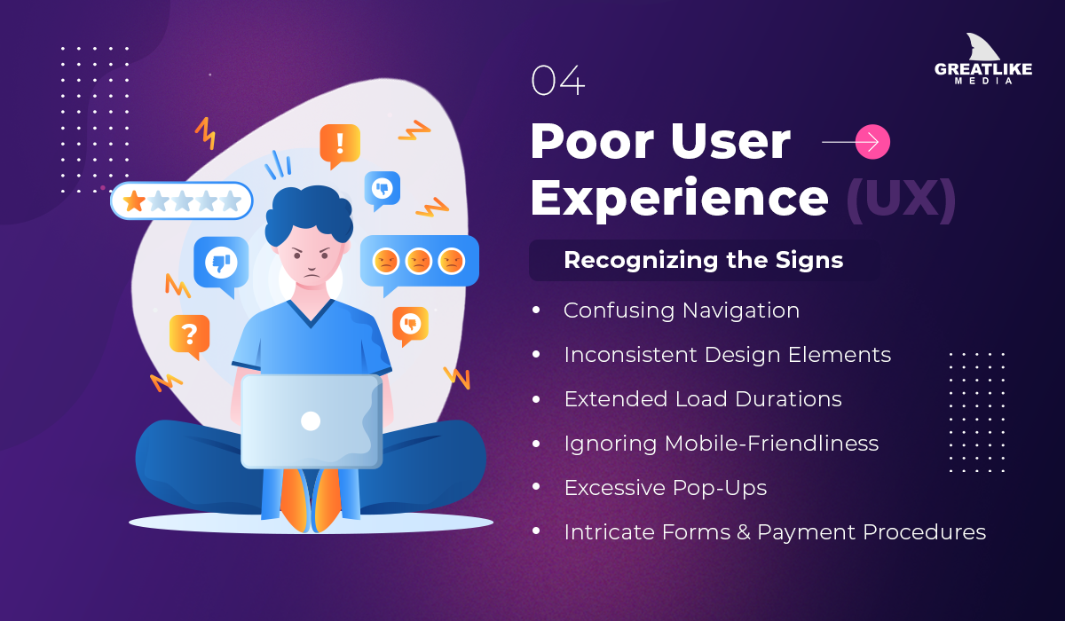
Recognizing the Signs:
-
Confusing Navigation
If users don’t get the desired information due to overcrowded menus, or ambiguous terms, they may abandon the platform. Navigation should be instinctive, ushering users efficiently.
-
Inconsistent Design Elements
A consistent design language is essential for a website. Diverse fonts, fluctuating color schemes, or inconsistent design themes can appear informal and confuse users.
-
Extended Load Durations
In today’s fast-paced world, waiting can be agonizing. A delay in page loading can deter users, with many departing if there’s too long of a wait.
-
Ignoring Mobile-Friendliness
Indeed mobile browsers have surpassed the desktop in volume. Thus, not optimizing for mobile is like sidelining a substantial segment of potential users.
-
Excessive Pop-Ups
Pop-ups, when used judiciously, can be effective. However, a barrage can be off-putting, driving users away.
-
Intricate Forms & Payment Procedures
A perplexing checkout process can deter users, often resulting in abandoned efforts or lost sales.
5. Security Concerns
In our digitized environment, websites have transitioned from mere info to active transactional and interactive hubs. With these changes comes a profound responsibility for website managers to prioritize user security.
Upon accessing a website, users impart certain data, sometimes actively through form submissions and sometimes passively via cookies. This trust is the linchpin of online relations. But escalating cyber threats—from data breaches to aggressive cyber-attacks—threaten to destabilize this trust.

Recognizing the Signs:
-
Missing SSL Validation
An SSL (Secure Socket Layer) certificate is foundational for website security. If a site’s URL begins with “http://” instead of “https://”, it jeopardizes data safety and users’ information. Also, contemporary browsers may flag it as insecure.
-
Legacy Software and Plugins
Using old software versions can make a website vulnerable. It’s crucial to stay updated, sealing any potential breaches and strengthening site defences.
-
Atypical User Activities
An unexpected spike in web traffic, especially if localized to specific areas or domains, may cause cyber-attacks. Continual web analytics monitoring can spot such contortion.
-
Rise in Spam or Dubious Communications
An abundance of suspicious messages or user comments may indicate the site is under attack.
6. Outdated Content
The saying, “content is king,” resonates profoundly in the digital age. Consider websites as the digital face of businesses in this modern era.
Within them, content operates like a compelling sales pitch, an informative guide, and the voice of the brand. It not only establishes a solid digital footprint but also ensures the content remains current and in tune with the times.
Whether it’s through text, videos, images, or other formats, content pulsates at the core of any website. It expresses the brand’s mission, presents solutions, enlightens visitors, and fosters meaningful engagement.
Fresh and timely content embodies an organization that’s vibrant, engaged, and looking toward the future. On the contrary, outdated content may make a brand out of touch or no longer relevant.

Recognizing the Signs:
-
Outdated Copyright Notices
Stumbling upon a copyright notice that’s several years old in the website footer can be a glaring oversight. It shows that the website doesn’t contain updated content for some time.
-
No Recent Blog Updates
It is always essential to keep your website blogs updated with the latest topics and trends. It keeps your brand ahead with new developments or insights.
-
Stale Product and Service Descriptions
Information that defines old prices, and services that are no longer available can deter potential customers.
-
Non-functioning Links
Hyperlinks that point to irrelevant external sites reduce both the user experience and the reliability of the content.
7. Low Conversion Rates
Businesses get website designs for their specific mottos. Whether the aim is to inform, entertain, or sell, each site has an ultimate objective. It works to motivate a specific user action, or in digital terms, a ‘conversion.
This could range from a user signing up for a newsletter to executing an e-commerce purchase. Conversions are crucial metrics, indicating the success or effectiveness of a site. However, when these rates drop, it becomes evident that the website might not be meeting user expectations or goals.
The conversion rate isn’t just a figure; it’s an insight into the website’s prowess. It provides a deeper understanding, surpassing mere visitor counts, to reveal the quality of engagement. Moreover, it shows how effectively the content and design align with user goals.
Recognizing the Signs:
-
High Bounce Rates
If the visitors leave your website after viewing only a single page, it suggests potential misalignment in content. Also, it shows a misalignment of design as per user expectations.
-
Shopping Cart Abandonment
If users choose items but don’t make the purchase, it shows issues in the checkout or payment process.
-
Incomplete Form Submissions
If users initiate but don’t complete forms—it shows these forms are too long or confusing.
-
Low Engagement on CTAs
When Call-to-Action buttons see sparse interaction, their design or messaging may not motivate the users.
-
Mismatched User Expectations
If users find content or offers that don’t align with their expectations, it can lead to decreased conversions.
-
Lack of Clear Value Proposition
You may lose visitors if your website lacks a clear value proposition.
The Critical Importance of Continuous Website Monitoring
While we’ve already discussed the major signs of website updates, there’s an underlying theme that deserves its own focus. The importance of monitoring and assessing your website’s performance and user engagement.

Why Continuous Monitoring Matters:
-
Adapting to Technological Advancements
The digital landscape is rapidly shifting and advancing. Regular monitoring of your website helps you identify and integrate cutting-edge tools and innovations that can supercharge your site’s operations.
-
Meeting User Expectations
Today’s web users aren’t just discerning; they’re demanding. They expect zippy load speeds, user-friendly navigation, captivating content, and crisp visuals. In-depth analytics resolve the gaps in and help you meet the users’ expectations.
-
Getting the Edge Over Rivals
The digital marketplace is highly competitive. With a fine-tuning website, you can make it stand unique and stay ahead of the fierce competition.
How to Implement Continuous Monitoring:
-
Routine Dive into Analytics
Platforms like Google Analytics reveal everything from visitor backgrounds to the pages they frequent the most. Make it a ritual—maybe at the start of every month—to unearth these treasures of insights.
-
Feedback Collection
Nothing can beat first-hand feedback. Sometimes, the most glaring areas of enhancement are ones you hadn’t even considered. Why not integrate a quick feedback tool or a survey on your site?
-
The A/B Approach
Think of this as a controlled experiment for your website. Present two iterations of a web page and gauge which one garners better engagement. It’s a straightforward strategy to test and verify any changes you’re contemplating.
-
Stay Updated with Trends
Technology and design never stand still. Whether it’s signing up for a UX-focused newsletter or setting up a webinar, make sure to update your knowledge.
Conclusion
Think of a company’s website as more than a mere digital catalogue. This idea transforms our view, highlighting that a website isn’t just a “set it and forget it” affair. It’s much like your favourite local shop; it needs constant care, updates, and occasional makeovers to remain fresh, and on-trend.
 Back to main posts