August 14, 2023
10 Tips on How to Improve Your Website’s User Experience
Websites are vital for companies to reach their target audience in the digital era. Millions of websites compete for visitors’ attention, making a great user experience (UX) essential. User experience includes navigation, readability, loading speed, and contentment.
For many reasons, a good user experience is crucial. First, it affects user retention and engagement. Visitors may switch to a competitor’s if a website is hard to use or sluggish to load. Alternatively, a pleasant UX encourages people to remain longer, browse more pages, and buy.
Positive website user experience boosts conversion rates and ROI. When website visitors are satisfied, they are more likely to buy, subscribe, or fill out a contact form. Sales and company growth rise.
Today, we’ll discuss 10 practical ways firms may enhance their websites’ user experience. UX suggestions include website performance, mobile adaptability, content readability, and visual hierarchy.
According to Marketo, as many as 96% of visitors to your website are not yet ready to purchase if your website is not appealing. Businesses may design user-friendly websites that captivate visitors, keep them coming back, and boost company success by following these rules. In the changing digital world, user experience must be evaluated and improved often to satisfy user wants and expectations.
What is User Experience (UX)?
UX is the total experience and sensations a user gets while engaging with a product, system, or service, especially in digital interfaces like websites, apps, and software. It covers the whole user experience, from first visit or launch to ultimate engagement and beyond.
UX includes usability, functionality, accessibility, and emotional reaction, not simply aesthetic design or layout. UX design aims to produce intuitive, efficient, and entertaining goods and experiences.
Positive UX means users can quickly attain objectives, locate relevant information, and complete activities without annoyance or misunderstanding. Harmful UX may cause user irritation, high bounce rates, and corporate losses.
How to Create a User-Friendly Website?
It’s essential to be wary of websites that openly promote their proprietor and the services they provide. An excellent website can persuade even a casual browser to make a purchase.
A user-friendly website can be developed only by always keeping the visitor in mind. Every user experience design company must take this into account first and foremost.
So, what exactly is the process? how well you understand user goals, trends, and problems. If you know who you’re doing something for, you can ensure it meets their needs.
A user-friendly website may be developed using digital tools, user research methods, and collaborative design. Forbes found that a well-designed user interface increased the conversion rate by 200 percent.
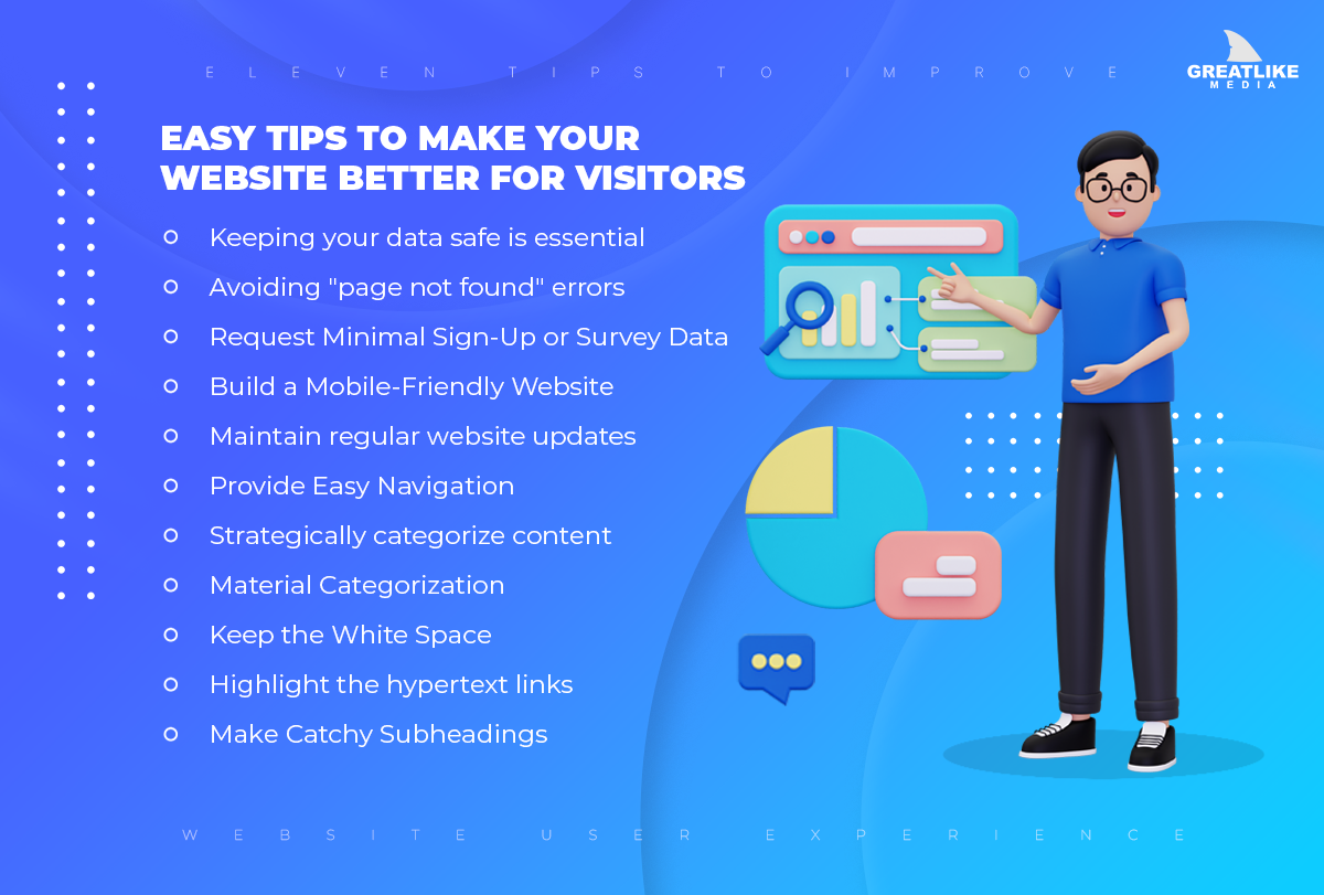
Easy Tips to Make Your Website Better for Visitors

-
Keeping your data safe is essential
Customers who don’t trust a site with their financial information are less inclined to buy anything. The safety of any networked computer system is paramount. It doesn’t matter how advanced those settings are if users aren’t made aware of a site’s security settings.
Putting seemingly harmless elements like lock symbols or a security validation message in places where sensitive data is gathered may help a user experience designer alleviate these concerns. Finding a balance between user safety and satisfaction might significantly impact a website’s overall success.
-
Avoiding “page not found” errors
Every user has experienced the frustration of seeing the “404” or “page not found” error message. One measure of your website’s success is the percentage of your target audience that takes the hint and never returns.
It is no use if users can’t find their way around your website. When pages or the whole site take too long to load, visitors will likely get frustrated and leave, which might be signalled by a custom 404 error.
Make a custom 404 page using an already 404 template. The user would be informed if there were any problems when processing the request. A decent 404 page should determine the cause of the mistake and take the visitor directly to the appropriate page.
-
Request Minimal Sign-Up or Survey Data
Successful companies always listen to their customers. Just because your website is up or your store is now accepting customers doesn’t mean you can stop testing the user interface and user experience.
Use web-based feedback and polling tools to conduct surveys and collect customer feedback. The form is an excellent tool for this aim. You may easily create documents that meet industry standards with our Form Builder software.
A stress-free consumer experience is great for business, but you should ensure your site’s forms are brief and to the point. Only your email address and name are often needed to sign up for a website or newsletter.
In today’s rushed culture, most people won’t complete a lengthy registration or survey form. Users prefer simple, concise forms because of this.
-
Build a Mobile-Friendly Website
A website that adapts to the user’s screen size As technology has progressed, so too have the types of portable gadgets that can access the internet. Your website has to look attractive and be easy to use on smartphones, tablets, desktop computers, and other devices your customers and visitors use.
Not only is this crucial, but Google is also penalizing sites that need to be mobile-friendly, which might affect your search engine ranks and drive away prospective clients.
-
Maintain regular website updates
Building online recognition for your business requires consistent page design throughout your website. Use the editor’s features to maintain font, color, and tone consistency across your website.
Maintaining uniformity in headings, button styles, design components, artwork style, and photography is essential. Inconsistencies and alterations from one page to the next may cause users to get bewildered. Your site’s user experience will improve if you constantly remind users they are still on it.
-
Provide Easy Navigation
Visitors may quickly get to the content that users like most using the site’s menus. Use clear, uncomplicated language in your navigation headings so that first-time visitors can soon become oriented and return to reading the material they came to read.
Users have preconceived notions of where your navigation should lead them; if you don’t adhere to them, you risk losing them as customers. Less time than you think is available to make an impact on visitors.
Visitors will have an easier time navigating your site and finding the content they’re looking for if its layout is similar to other popular sites. The “home” button (or your logo, if it functions as a home button) at the top left corner of the navigation bar is an example of a staple that visitors to your site will look for.
Your site’s navigation is the central pillar of its structure. Look at the analytics data to see where people click on your site. You should organize your site’s top-performing parts into tabs for more straightforward navigation. Elements such as articles and commonly asked questions are organized into their subcategories.
The components of your navigation bar are only as valuable as the order in which you place them. It’s suggested, for instance, that you list the most significant topics first and the least important ones to the right.
The Home button, which leads back to the Landing Page, must be located either at the very left or the top of the navigation bar. The “contact us” link often appears in the right-hand corner of a webpage.
-
Strategically categorize content
Most people who go online do so with a purpose. If your content is well-organized, visitors may stay on your site longer to get the answers they need instead of going elsewhere.
Use a content generator to produce high-quality, unique material quickly, then save it where it belongs. Regarding style, brutalism will still be widely adopted in 2020. Brutalism is typified by a raw and straightforward manner that prioritizes the user’s experience. However, if your site is attractive and well-designed, it will show visitors that your business is forward-thinking and not afraid to try new things.
-
Material Categorization
If you choose a more traditional approach, consider how the layout will help the visitor understand the presented information. There are also some fresh styles like minimalism and broken grid layouts. These inclinations only emphasize how important it is to declutter, a topic that will be explored at length in the book’s second half.
-
Keep the White Space
Take out the fluff and divide the page into digestible chunks to make it easier to read. Color, images, and other design elements may also restrict sections. Check to see that everything is where it should be. The most pressing issues are dealt with first.
It’s easier to grasp when the text is divided into smaller sections. Use white space effectively, segment the page into manageable chunks, and reduce unnecessary words.
Empty spaces on a website may be used to advertise and highlight specific items for sale. Furthermore, white space allows for more exploratory formatting. More white space on a page improves readability.
Your website will have a more open, modern look and feel if you use plenty of white space. To adequately express this feeling to the consumer, your brand’s visual identity should mirror this feeling. Website usability greatly benefits from the thoughtful use of white space.
-
Highlight the hypertext links
Hyperlinks’ principal purpose is to take the reader to relevant material on another page or website. Make sure these citations can be quickly located. Most websites simply highlight links using the primary color of the site.
If you want to catch the eye of the reader or user, consider selecting a distinct color that complements the site’s general color scheme. The length of a link is also crucial. It’s easy to make out the bigger connections. To keep tabs on how your relationships are growing, use Link Tracker.
-
Make Catchy Subheadings
Include relevant keywords in your text to attract your desired readers. Catchy headlines might be used to attract attention. Having a snappy, relevant, and eye-catching title can dramatically improve your site’s usability, exposure, click-through rate, and conversions since headings carry more weight with search engines than the rest of the content on a page.
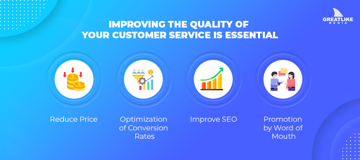
Improving the Quality of Your Customer Service is Essential
It’s not only applications and software that UX design may be used. It applies to everything we encounter, from websites to coffee cups to shoes. In all these scenarios, increasing sales requires enhancing the customer experience since satisfied buyers are more likely to purchase.

-
Reduce Price
The cost of development might be reduced significantly with the help of a well-designed user interface. After extensive user research and several design iterations, the possibility of making design changes post-launch is greatly minimized. So, although it may seem like a big expense at first, it saves a lot of money in the long run.
-
Optimization of Conversion Rates
Have you ever visited the official website of a product you were interested in purchasing online and felt an immediate kinship with it? What factors lead to this happening? Why?
Because it provides a satisfying combination of a simple interface and a natural, straightforward flow of functionality. It is short and contains just the most crucial details. That’s the effect that good UX design can have on your sales.
-
Improve SEO
Google’s ranking system places a premium on providing a positive user experience. Usability and search engine rankings go hand in together. The same holds for other types of advertising, like PPC and paid media. This implies that effective marketing campaigns and high-quality search engine optimization outcomes are all due to exceptional UX.
-
Promotion by Word of Mouth
Word of mouth will always be the most credible marketing, no matter how advanced other methods get. Customers who are satisfied with their purchase will tell others about it. Because individuals want to conduct business with someone they like and trust, this will lead to a growth in clientele.
Conclusion
UX can make or break a product, website, or service. It examines customer perception and interaction with digital interfaces beyond aesthetics. Usability, accessibility, visual appeal, and emotional connection boost UX, user satisfaction, retention, and brand loyalty.
Organizations may benefit from UX design strategy. Businesses should consider consumer needs, preferences, and pain points to boost conversion rates when building products for their target audience.
These 10 tips might improve your website user experience. With the right amount of each component, we can provide your website’s visitors with the finest experience. A good user experience by us will benefit your organization and consumers.
 Back to main posts