August 1, 2017
Guide to Successful SEO for E-Commerce Sites: Part 2
Now that you understand how to get your website noticed on Google and how to attract the right customer, you must insure your website home page is set and ready. You want a main page that will impress online visitors, while making sure it is clean and easy to navigate.
Part 2: Site Architecture
How a website looks makes all the difference when a consumer is deciding whether to remain on it. If the website appears too busy or outdated compared to others, you could very easily lose traffic.
A: Site flow
1: Site Navigation
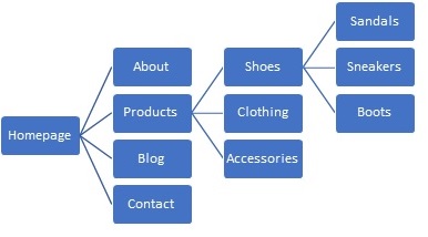
Setting up a website so all the inner pages are connected to each other helps rank higher and makes page navigation much easier. This is called inter-linking, and is a major factor in achieving website flow. By having each page connected, it can make going back very easily to the previous page, or all the way back to the home page, making the website user friendly.

You never want a potential customer to become frustrated on your website due to:
• Inability to return to a past page or home page
• Searching for a specific item that cannot be located
• Continuous distractions due to irrelevant information
The clearer the path, the more time someone will spend on an e-commerce site. It’s also important to note that whitespace can be your friend. Whitespace refers to spots on your website with no images or texts, but rather extra space allows for emphasis and easier reading for website visitors. For more tips on designing a user-friendly website, check out How to Improve Your Website User Experience.
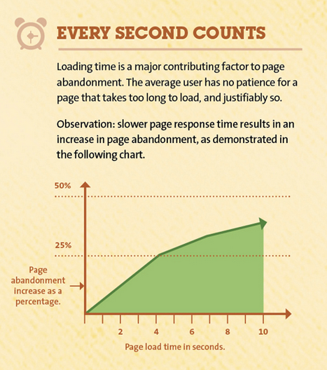
In today’s world, if a website doesn’t load within 5 seconds, it is common for a user to leave the website in search for another one. Google keeps track of website speed, and if it determines loading time is over 15 seconds, this will cause drop in ranking.
Research conducted by DOUBLECLICK (a Google owned site) found, “Sites that load in 5 seconds vs 19 seconds observed: 25% higher ad viewability (and) 70% longer average sessions (and) 35% lower bounce rates”.
2: To increase website speed

a. Find broken links.
– An example of this would be a link on your website is supposed to take you to another page, but instead a 404 error appears on the page. This is extremely frustrating to website visitors, and is still today one of the larger reasons a user will leave your website.
b. Remove unnecessary Plugins.
– A Plugin would be a piece of software, such as Flash Payer or QuickTime, that acts as an add-on to a web browser for functionality. These are great if you have additional content that needs to be seen, but they can slow down your website, create security concerns, and cause crashes and technical difficulties. Therefore, only keep them if necessary.
c. Optimize Images
– The way you save your photos before posting them makes a huge difference in the speed on your website. Always name your photos practically; do not leave the download file name such as MCR21678.jpg. If it is a picture of the beach, simple name it beach.jpg so Google will know what the image is about.
– There are two common types of images, a JPEG and an PNG. A PNG is an uncompressed image meaning it is higher quality, while a JPEG is compressed, meaning it has a lower quality, but a much smaller file size. Smaller the file, faster your website!
Photoshop, JPEG Mini, ImageOptim, and TinyPNG are all online tools that will work great at compressing (making smaller) images.
These same rules apply for websites on mobile platforms. If the website is not functional and is slow at loading the main page, you will see potential traffic disappear even quicker. For more information on creating a mobile website, visit 5 Essentials Your Mobile Website Should Have.
B: Content
1. Be predicable, while being unpredictable
This may sound strange coming from a Dallas web design company, but it is important to supply the traffic to a website with what they are expecting, while also surprising them. For example, if you post an AD on Google claiming to have a 50% sale on shoes, your landing page MUST mirror that. You don’t want people to find you untrustworthy by posting a Call to Action that is inaccurate.
Now, to stand out from competitors, you want to do something different than other sites, such as a fun web design. Possibly an interactive point on the website. Most important of all though, is to continue to post new and relevant content. If the website is never updated, Google will believe you are outdated and you will fall in ranking. With continuous fresh content, Google crawlers will be able to easily find your website and take your information and input it in the Google Search index. Using the index, they can better match you with potential customers online who are searching for you.
Websites continue to become more creative with flow and interactive options, which is why you should consider website trends that are continuing to grow in future.
To increase your ranking with an e-commerce website, pay attention to speed, content and site flow, as they are all extremely important. Customers want to have an enjoyable experience when searching for products, and the happier they are while on the website, the more likely their shopping cart is to grow. If you would like to learn more or are looking for hands-on help to achieve an e-commerce site for your business, check out our web design page or give us a call at (949) 342-5419.
 Back to main posts