July 26, 2023
Why is Responsive Web Design Crucial for Modern Businesses?
Having a business website is no longer an option. If you want to reach out to millennials, or as they are called- Gen X, you need a fully-functional website that can offer a seamless experience to your audience.
The behavioural patterns of millennials are changing in today’s digital world. Web developers also need to build websites that meet the users’ expectations. For example, most millennials use their smartphones to access the website. If your website is not responsive for mobile devices, you might miss many visitors who are your potential customers.
Let’s check out some statistics about the importance of responsive design.
- A study reveals that 75% of website credibility comes from website design.
- 89% of consumers shop from competitors if they don’t get a good user experience.
- 74% of users would return to a mobile-friendly website.
- Websites that offer a good user experience can increase conversion rates by up to 400%.
Do I need to convince you more about designing a responsive website? Ensure to launch a responsive website that offers a highly satisfying experience to your audience.
What is web design?
Web design is all about planning, brainstorming, and implementing the creation of a website that is user-friendly, easy to navigate, and offers a seamless user experience.
An intuitive, impressive, and user-centric web design can earn you brownie points. Your website’s design should be uncluttered, simple, and yet attractive. Your visitors should connect with the website instantly. It will surely reciprocate if you offer a good user experience. For that, a website with a good design is mandatory.
What is Responsive Web Design?
Responsible web design is a process of designing adaptive and flexible websites. No matter which device you use to access the website, the layout and other things will automatically adjust according to the screen size. A Responsive design performs excellently on tablets, desktops, and smartphones.
When a website adjusts as per the device, users can find it easy to navigate and read. Users will also not have to zoom the screen or scroll horizontally to read the content. Overall, a responsive website offers a seamless and effortless user experience.
Web designers use various techniques for responsive design. These techniques include fluid grids, media queries, flexible images, etc. With these techniques, a website adjusts the screen as per the device. Also, content prioritizing allows a website to show the vital content first, irrespective of your device.
A responsive web design adapts to the user’s device rather than asking a user to adjust to the website. It is vital because it increases engagement with the website. Furthermore, users spend more time on the website as they enjoy the journey. It improves your chances of conversions.
Examples of Responsive Web Design
If you want to see what a responsive website looks like, you are recommended to visit websites of Dropbox, Dribble, GitHub, Shopify, Magic Leap, and Slack. You can open them on the desktop or mobile browser, and you will come to know how seamless the user experience these websites offer.
How is Responsive Web Design Different?
Web designers use various techniques to design a responsive website, such as CSS3 Media Queries, Fluid Proportional-based Grids, and Flexible Images. These techniques combined adjust the website on different screen sizes of devices.
- For example, the fluid grid technique ensures page element sizing is done in units like percentages, not pixels.
- Furthermore, flexible images provide unit-type sizing to ensure the photos don’t display outside the element.
- With Media Queries, pages use various CSS style rules depending on the device a visitor is using to access the website.
Types of responsive web design
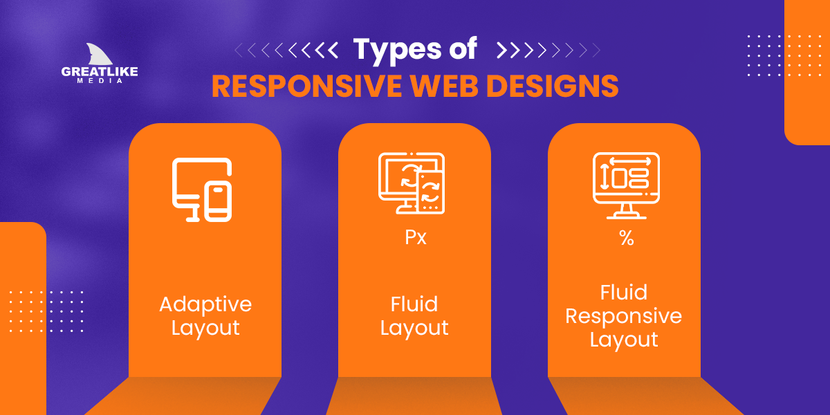
Here is a list of different types of responsive web design:

Adaptive Layout
In adaptive, responsive design, web designers use Absolute units for designing static blocks. These absolute units measure the size of elements in fixed pixels that will not change no matter which device you use to access the website.
Fluid Layout
The screen width is measured in relative units such as percentages in Fluid layout design. Here, the length of any image or page is calculated according to other elements. Percentage-based lengths of images automatically adjust as per the width of the browser you are using. It is challenging to develop a Fluid-layout based responsive design.
Fluid Responsive Layout
It is the finest mix of adaptive and fluid layouts. In a Fluid, Responsive layout, various web page elements shrink or stretch to fit into the size of the browser. Designers use multiple media queries to design highly responsive and user–friendly web pages.
Pros & Cons of Responsive Design & regular web design
Here is a list of the pros and cons of responsive and traditional web design:
Pros of a responsive web design:
- A responsive design offers a seamless user experience. Users would love to access the website on different platforms, such as tablets, mobiles, and desktops.
- You will see a noticeable change in traffic and conversions.
- Designing a responsive web design reduces the total cost and development time.
- Users don’t need to zoom, scroll, or resize web pages.
- A responsive website also helps rank the website at the top of search engines.
- User engagement increases to a great extent.
- Designers don’t have to use multiple websites for multiple devices.
Cons of a responsive web design:
- You must plan, test, and optimize carefully to ensure a website looks great and offers a seamless user experience.
- If you use large images, you might find issues such as long loading times and lower performance.
- Sometimes, you might be unable to use features such as push notifications, touch gestures, and camera access.
- Designers might need to accommodate particular elements such as fonts, menus, and buttons.
- It might affect your SEO ranking and engagement.
Pros of a Regular Web Design :
- It can take a little bit of time to design a website.
- You will be able to develop a website with reduced costs.
- You won’t need experienced web designers.
Cons of a Regular Web Design :
- You will see a drop in your website rankings.
- Maintaining a website is challenging and requires more time.
- You might miss a large number of visitors who use mobile phones or tablets to access the website.
- Lesser user engagement and conversions.
Business growth using responsive design Over those who stick with standard designs.
As discussed earlier, responsive websites will offer superior engagement and high rankings. It will automatically improve user experience, conversions, and revenues.
On the other hand, unresponsive websites might not be able to offer you these benefits. It might work moderately well on the desktop, but if your target audience uses mobile devices or tablets, they will need help using the website. It will reduce their attention span, and they might abandon the website.
Responsive design can help reach new users to accelerate your business growth. Also, they spend more time on the website as they love the layout and responsiveness.
On the other hand, with a traditional web design, you might sustain the business, but growing the business might take time and effort. You will not be able to gain more visitors, and your business will suffer.
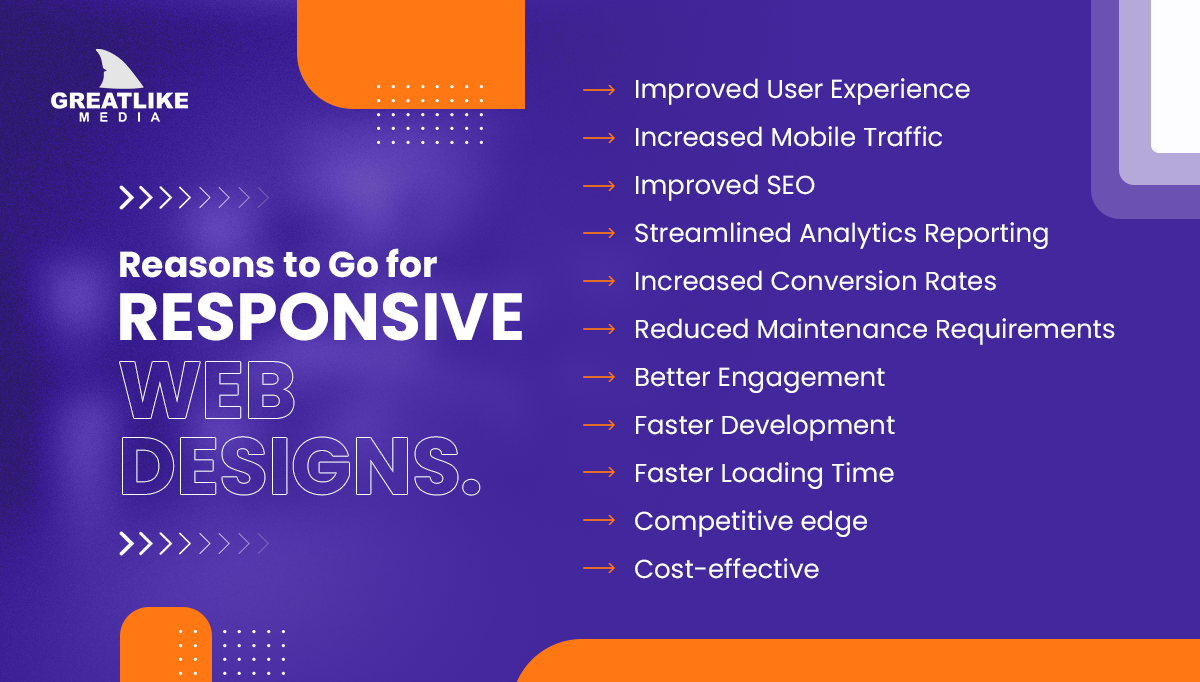
Reasons to Go for Responsive Web Design
If you still want more reasons to decide whether to go for a responsive web design, here is a list of reasons:

Improved User Experience
Users would love to spend more time on a responsive website, so the overall user experience will also improve. You might notice the longer time spent on the website. Also, users will feel special as they can navigate and read content easily.
Increased Mobile Traffic
A website with responsive design ranks higher on SERPs as they meet all the guidelines and expectations of search engines. Even Google has stated that mobile-friendly websites are a vital factor affecting rankings.
Improved SEO
Responsive websites offer a great user experience to visitors. Google loves it and will rank the website accordingly. It will help rank your website at the top of search engine results, inviting more organic visits and conversions.
Streamlined Analytics Reporting
When you have multiple websites for various devices, it might be challenging to track visitors’ journeys. You will need to go through various conversion routes and funnels, making it a tiring process.
Google Analytics and other website-mapping analytics tools excellently adapt to responsive web applications. They will give you a comprehensive website report with all details and journeys. You will be able to make decisions based on such valuable insights.
Increased Conversion Rates
You will see a rise in your conversion rates with a responsive website. Users who find it easy to navigate the website will also take appropriate actions as their journeys are smooth and streamlined. It will affect the conversion rates positively.
Reduced Maintenance Requirements
Responsive websites don’t need more maintenance. You can keep editing content and certain elements based on analytics reports: no need to make significant changes and no increased maintenance requirements.
Better Engagement
Users spending more time on the website will keep them glued to it. It will increase user engagement and, ultimately, conversions.
Faster Development
Responsive website development is smooth sailing, especially when hiring a good website design company. Experienced website designers know all the tricks and techniques that drive faster development.
Faster Loading Time
As responsive websites easily adjust the screen size of various devices, they will load quickly, offering a great user experience to your visitors. It is essential as smartphone users have a limited attention span and will only abandon the website if it loads slowly, within 2-4 seconds.
Competitive edge
A responsive website offers a competitive advantage as you will receive more engagement, better SEO rankings, and improved conversions.
Cost-effective
A responsive website can cut down the development cost to a great extent as businesses don’t have to create separate websites for mobile devices and tablets.
Conclusion
A responsive web design is the need of the hour. It offers a wide range of benefits to designers and businesses. Consumers will spend more time on websites and click on CTAs. Furthermore, a responsive website improves SEO rankings and conversions by offering a great user experience.
You only need a reputable website design company with highly skilled designers. Make sure that they understand your business requirements and act accordingly.
FAQs
1. What is a responsive web design?
Responsive design is a website design process that offers visitors a seamless user experience irrespective of the device they use to access it. Developers use various techniques to design a responsive website design.
2. Why do you need a responsive web design?
Millennials use their smartphones to access websites. What if you open a website on your smartphone that does not offer a good experience? Would you revisit the same website? Probably you will not. Your visitors will also act similarly if your website needs more responsiveness.
3. What are the benefits of a responsive website design?
- You will get better rankings on search engine results.
- Users will spend more time on your website.
- Your website’s conversion rates will improve.
- You will be able to see a spike in your user engagement.
- Developing a responsive website is quick and effortless if you have hired a reputed website design company.
- You will be able to make data-driven decisions.
4. How much does a responsive website cost?
Well, the answer is complex. A wide range of factors determine the cost of developing a responsive web design. Some of these factors are the website’s features, the number of developers you employ for web development, and many others.
5. What is CMS in website design?
A content management system like WordPress allows designers or businesses to write, edit, post, and delete digital content without writing code. A good CMS can help you maintain and edit your website pages effortlessly. Content management systems mostly have a simple interface and are user-friendly.
6. What is Mockup in Website Design?
A mockup is a rough roadmap of your website’s appearance once it goes live. It will give a feel of an actual website with all the images, graphics, navigation functions, and other elements. You will get a clear idea of your website’s appearance and whether you should make any changes.
7. What is adaptive website design?
In adaptive website design, developers use static layouts that are pre-formatted. It then displays one of these layouts depending on the visitor’s device. Unlike a Fluid responsive design that automatically resizes the page based on the device, an adaptive design first detects the size of the screen. Then it loads the page with the best appropriate format.
 Back to main posts
